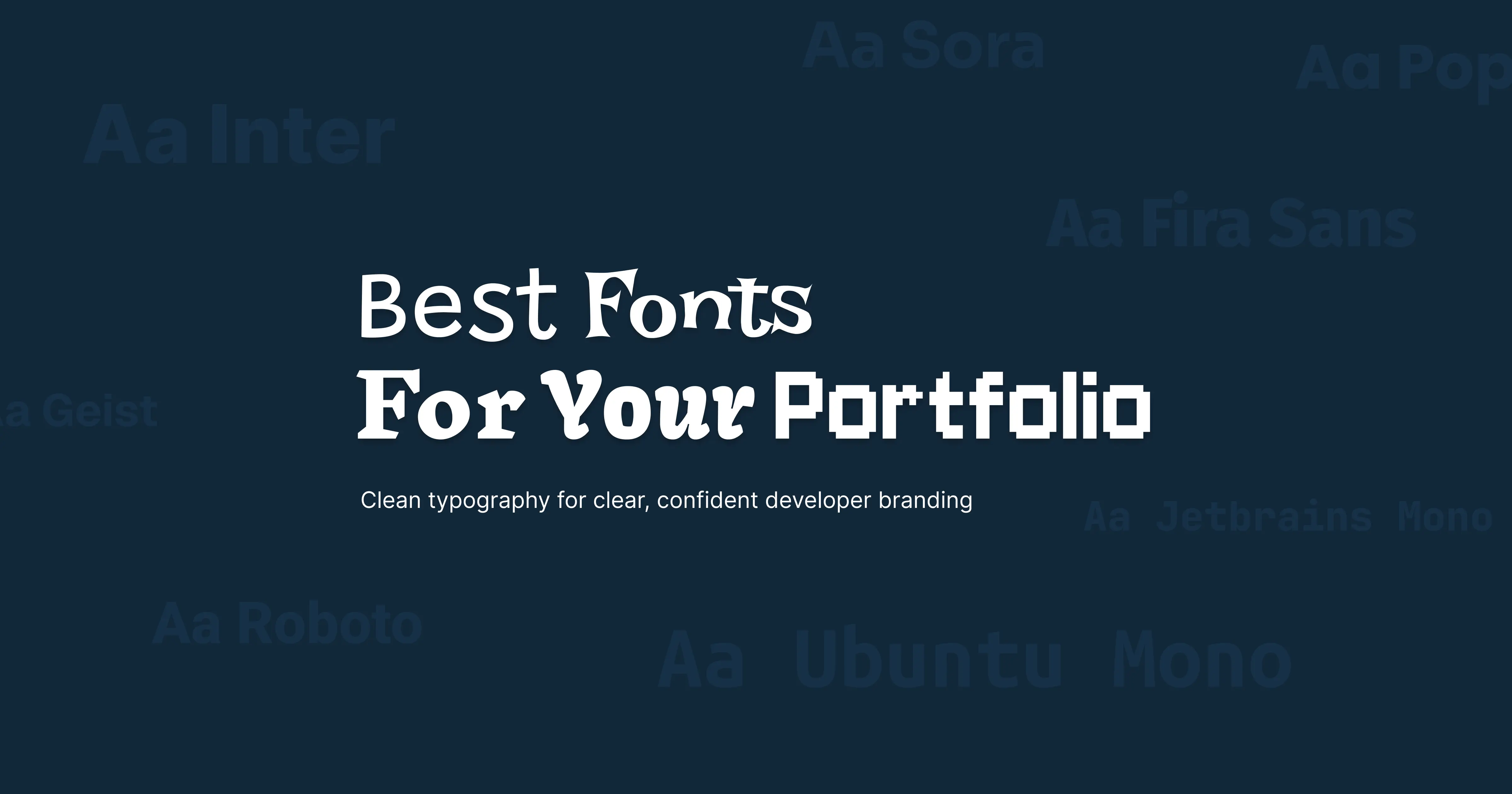
Choosing the best font for your portfolio is key to setting a strong first impression. A clean and professional font that matches the vibe of your portfolio will enhance the user experience and make your work feel more polished.
Readability is another crucial factor. If your portfolio is playful or creative, you might experiment with more decorative fonts. For a professional or corporate tone, opt for fonts that are clean, simple, and highly legible.
Cross-device compatibility is also important. Fonts that look great on desktop may render differently on mobile or tablet screens. Always test your font choices across different devices to ensure a consistent experience.
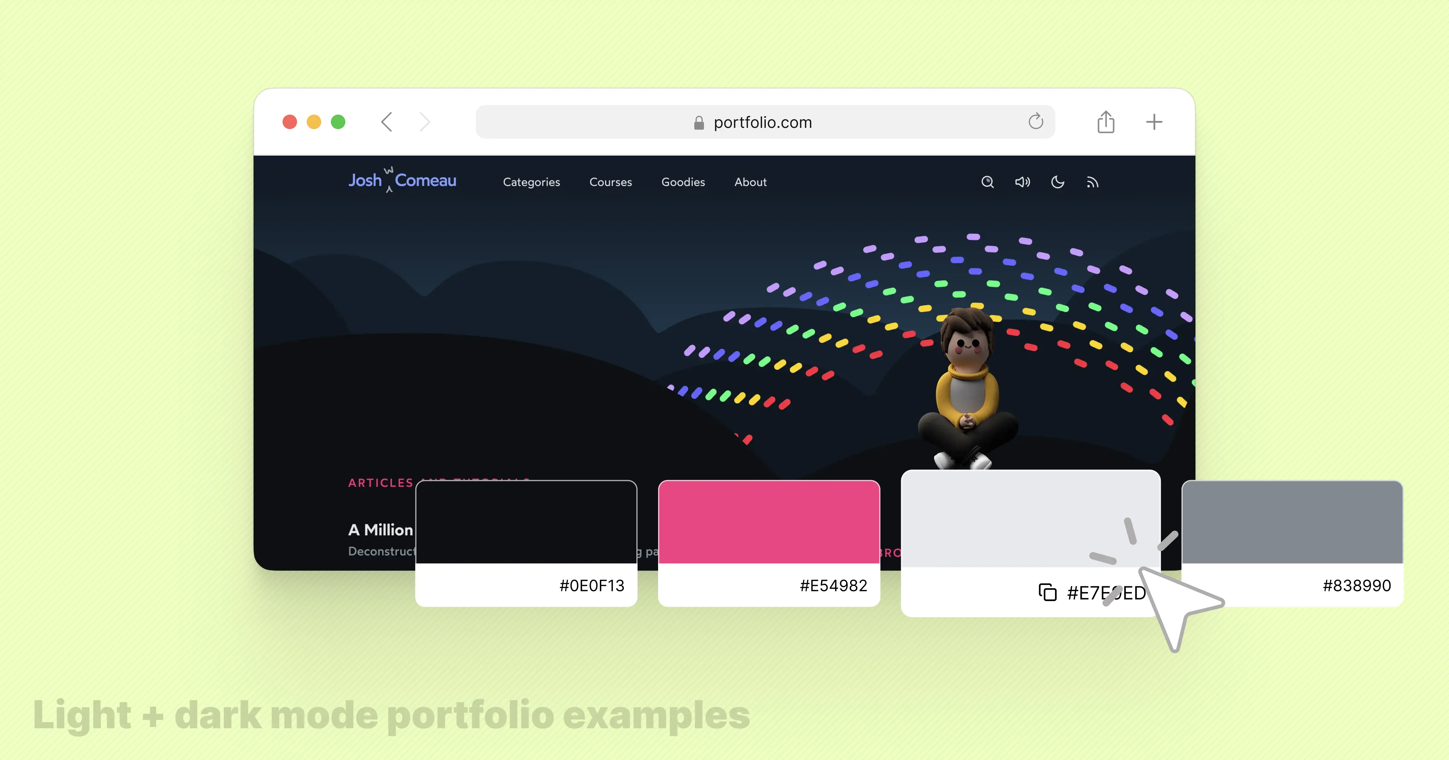
Tip: Fonts are only part of the story. Color palettes also play a huge role in guiding attention and reinforcing your brand. You can check out my guide on Best Color Palettes for Developer Portfolios (2025) + Real Examples to pair fonts with colors effectively.
Open Sans
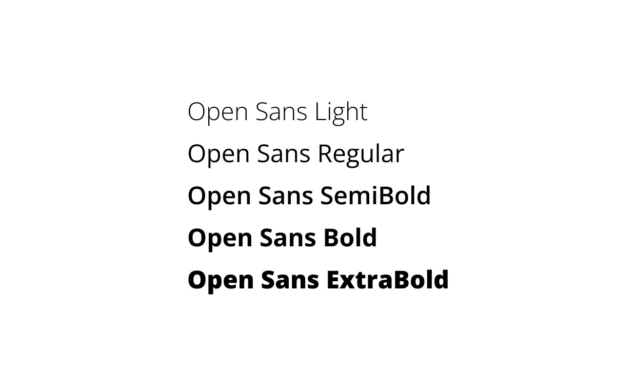
Open Sans is a highly versatile sans-serif font with a clean, modern look. It offers excellent readability at both small and large sizes, making it ideal for web and mobile design. Its neutral style balances approachability with professionalism, perfect for both personal and business portfolios.
Inter
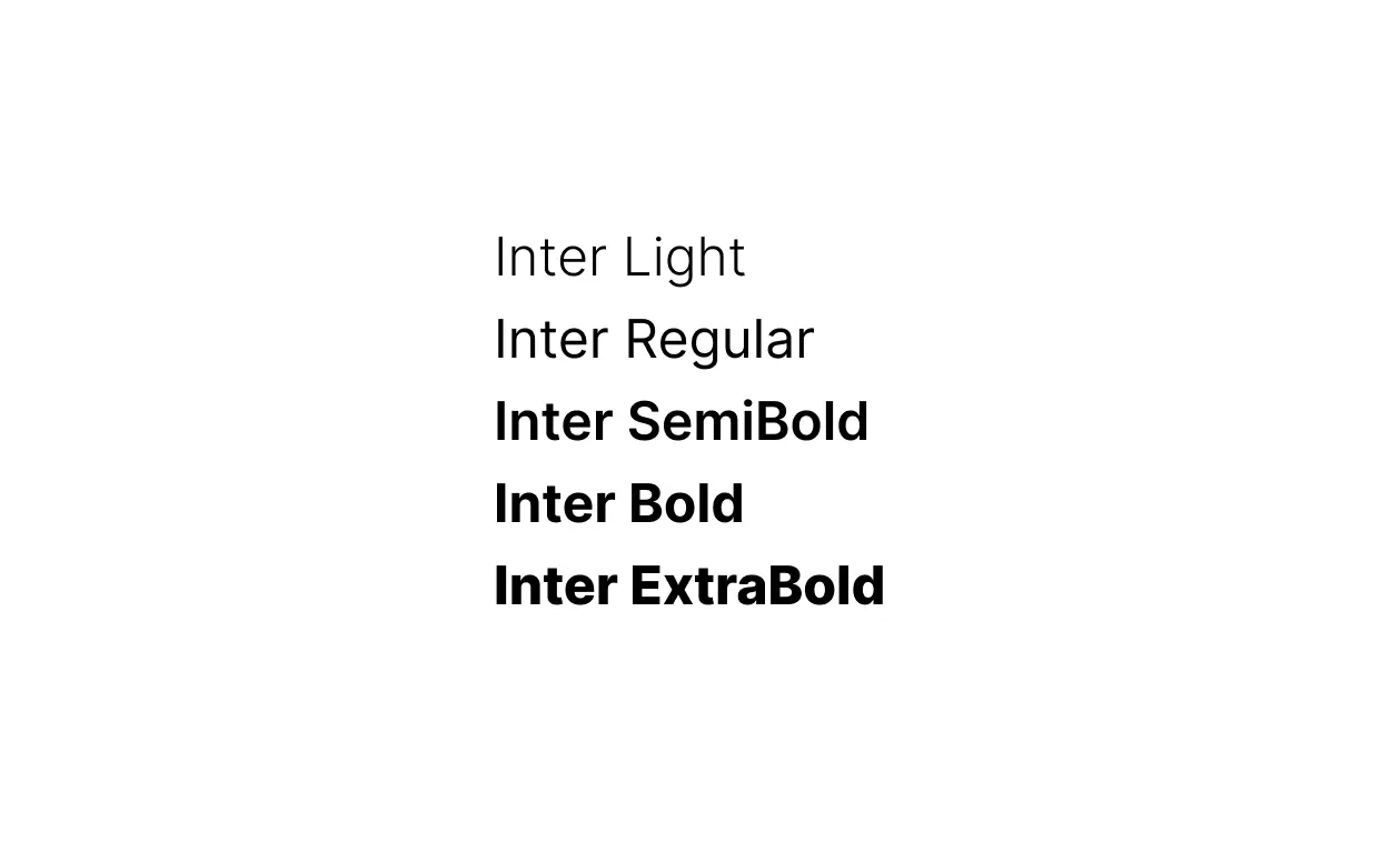
Inter is designed specifically for digital interfaces. With wide proportions and high legibility, it's perfect for body text on web and mobile. Subtle rounded corners give it a friendly and inviting appearance, while maintaining clarity at all sizes.
Lato
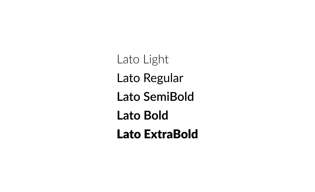
Lato is a humanist sans-serif font that combines a sleek, professional look with a friendly feel. Its versatility makes it suitable for both headlines and body text, striking a balance between modern elegance and approachability.
Helvetica Neue
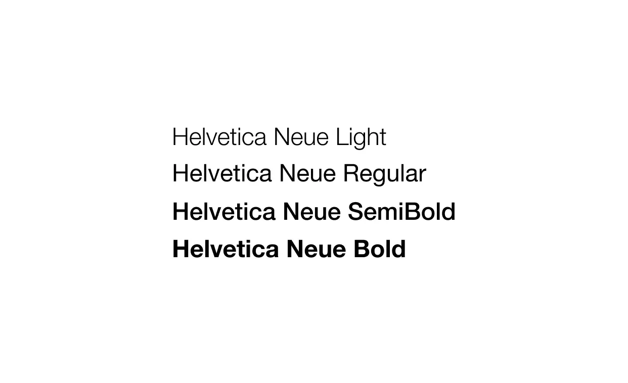
Helvetica Neue refines the classic Helvetica with a clean, minimalist design. Its geometric shapes and uniformity give it a timeless and professional feel, widely used in branding and advertising for its versatility.
Futura
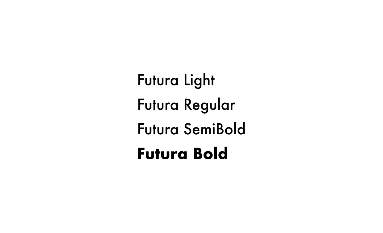
Futura is a geometric sans-serif font with bold, modernist shapes. Often associated with futuristic and minimalist design, it works best for strong headlines and contemporary branding projects.
Arial
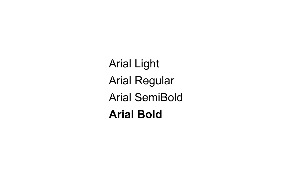
Arial is a widely available sans-serif font known for its clarity and simplicity. Its neutral and balanced design makes it adaptable to almost any type of content, offering universal accessibility and readability.
Roboto
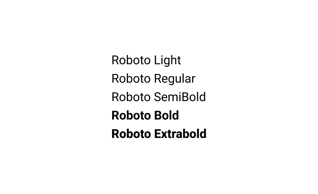
Roboto combines a mechanical structure with soft curves, creating a friendly yet modern sans-serif font. Its versatility works well for both body text and headlines, making it popular for web and mobile interfaces.
Try It Yourself: Interactive Preview
Want to see how different fonts and colors will look on your portfolio? Use the interactive hero preview below to experiment in real time.
- Change heading and body fonts to find the perfect combination.
- Adjust background and text colors to match your branding.
- Preview instantly without touching any code.
This tool is a simple way to visualize your portfolio design before committing, making it easier to choose fonts that are readable, stylish, and professional.
Example Headline
A short example subheadline.
Quick Tips for Using Fonts in Your Portfolio
- Limit font choices: Stick to 2–3 fonts to maintain a clean and cohesive design.
- Use hierarchy wisely: Different weights or styles for headings, subheadings, and body text help guide the reader.
- Test legibility: Ensure readability on both desktop and mobile devices.
- Pair fonts with color: The right color palette reinforces typography and overall branding. Check out my color palette guide for ideas.
Conclusion
Selecting the right fonts is one of the simplest ways to elevate your portfolio. When combined with effective color choices, typography can help make your work more readable, professional, and memorable.
Typically, most developer portfolios can get away from needing to use less creative fonts and colors. However, to see creative font pairings and color palettes check out frontend developer portfolios from our community.