Creating a developer portfolio isn’t just about listing your projects—it’s about presenting your work in a visually compelling way. One of the most important design choices is selecting the right portfolio color palette. Your color scheme affects branding, readability, and the overall impression visitors get from your site.
In this guide, we’ll cover why color palettes matter for developer portfolios, how to choose the right colors, and look at examples from real-world developer portfolios for inspiration. Whether you want a sleek, professional look or a bold, eye-catching design, this guide will help you create a portfolio that stands out.
If you are building your portfolio, consider checking out Create a Standout Web Developer Portfolio: Tips and Best Practices for a comprehensive guide to help build out your portfolio.
Why Color Palettes Matter for Developer Portfolios
Your color palette is one of the most important visual elements of your portfolio. It shapes first impressions, reinforces your brand, and impacts readability.
- First Impressions – A well-chosen palette signals professionalism and expertise.
- Branding – Colors reflect your style, whether modern and sleek or bold and creative.
- Readability & Accessibility – High contrast improves legibility and inclusivity.
- Psychology – Colors evoke emotions (e.g., blue = trust, purple = creativity).
Studies show users form an opinion about your site in just 50 milliseconds — color choice plays a huge role in that first impression.
A strong color palette makes your portfolio visually engaging, memorable, and functional.
How to Choose the Right Color Palette for Your Developer Portfolio
Choosing the right color palette for your developer portfolio isn’t just about picking colors you like—it’s about crafting an intentional visual identity that resonates with your audience. The right colors can make your portfolio look professional, communicate your brand, and enhance readability. But where do you start? Consider these key steps:
1. Define Your Brand Identity
Before selecting colors, ask yourself: What message do I want my portfolio to convey?
- Minimalist & Modern – Clean, neutral tones with subtle accent colors.
- Creative & Bold – Vibrant hues and high contrast for a dynamic feel.
- Corporate & Professional – Muted, sophisticated palettes for a polished look.
2. Find Color Inspiration
Struggling to pick a palette? Draw inspiration from:
- Browse real-world developer portfolios on webportfolios.dev/portfolios.
- Design communities like Dribbble and Behance.
- AI-powered tools such as Coolors and Adobe Color to generate harmonious combinations.
3. Understand Color Harmonies
Not all colors work well together, but understanding basic color harmonies can help you create a balanced palette. For example:
- Monochromatic – Different shades of a single color (great for a clean, modern look).
- Complementary – Opposite colors on the wheel for contrast (ideal for bold portfolios).
- Analogous – Neighboring colors for a natural, cohesive feel.
- Triadic – Three evenly spaced colors for a balanced but striking aesthetic.
| Harmony | Description | Best For |
|---|---|---|
| Monochromatic | Shades of one color | Minimalist & modern portfolios |
| Complementary | Opposite colors on the wheel | Bold, creative portfolios |
| Analogous | Neighboring colors | Cohesive, natural look |
| Triadic | Three evenly spaced colors | Balanced but striking design |
Using these harmonies as a guide ensures your palette feels balanced and intentional.
4. Consider Accessibility
Your portfolio should be readable and inclusive for everyone. Avoid low contrast and test your palette with:
- WebAIM Contrast Checker to ensure text is easy to read.
- Sim Daltonism to preview how color-blind users might see your design.
- Dark mode vs. light mode compatibility to enhance user experience.
5. Test Before Finalizing
Before committing, test your color scheme:
- Apply it to UI elements (buttons, backgrounds, text).
- View it on different screens to check consistency.
- Get feedback from peers to refine your choices.
Struggling to finalize your color palette? Check out free developer portfolio website templates - each listed template comes with well-designed, pre-applied color schemes you can borrow or adapt.
Common Mistakes to Avoid
Even with a carefully chosen color palette for your developer portfolio, small missteps can undermine its effectiveness. Avoid these common pitfalls to keep your portfolio visually appealing, readable, and professional:
1. Using Too Many Colors
A palette that’s too busy can overwhelm visitors. Stick to a primary, secondary, and accent color to maintain a clean, cohesive look.
2. Poor Contrast
Low contrast between text and background reduces readability, especially for users with visual impairments. Test your palette with tools like WebAIM Contrast Checker to ensure accessibility.
3. Ignoring Branding Consistency
Your portfolio reflects your personal or professional brand. Make sure your colors align with your resume, social media, and other branding elements for a cohesive identity.
4. Overly Bright or Saturated Colors
Vibrant colors can add personality, but overly bright hues may strain the eyes. Use bold colors strategically and pair them with neutral tones to maintain balance.
5. Not Considering Dark Mode
Many users browse in dark mode, and ignoring it can hurt usability. Check that your palette works seamlessly in both light and dark themes, ensuring text remains readable and UI elements remain clear.
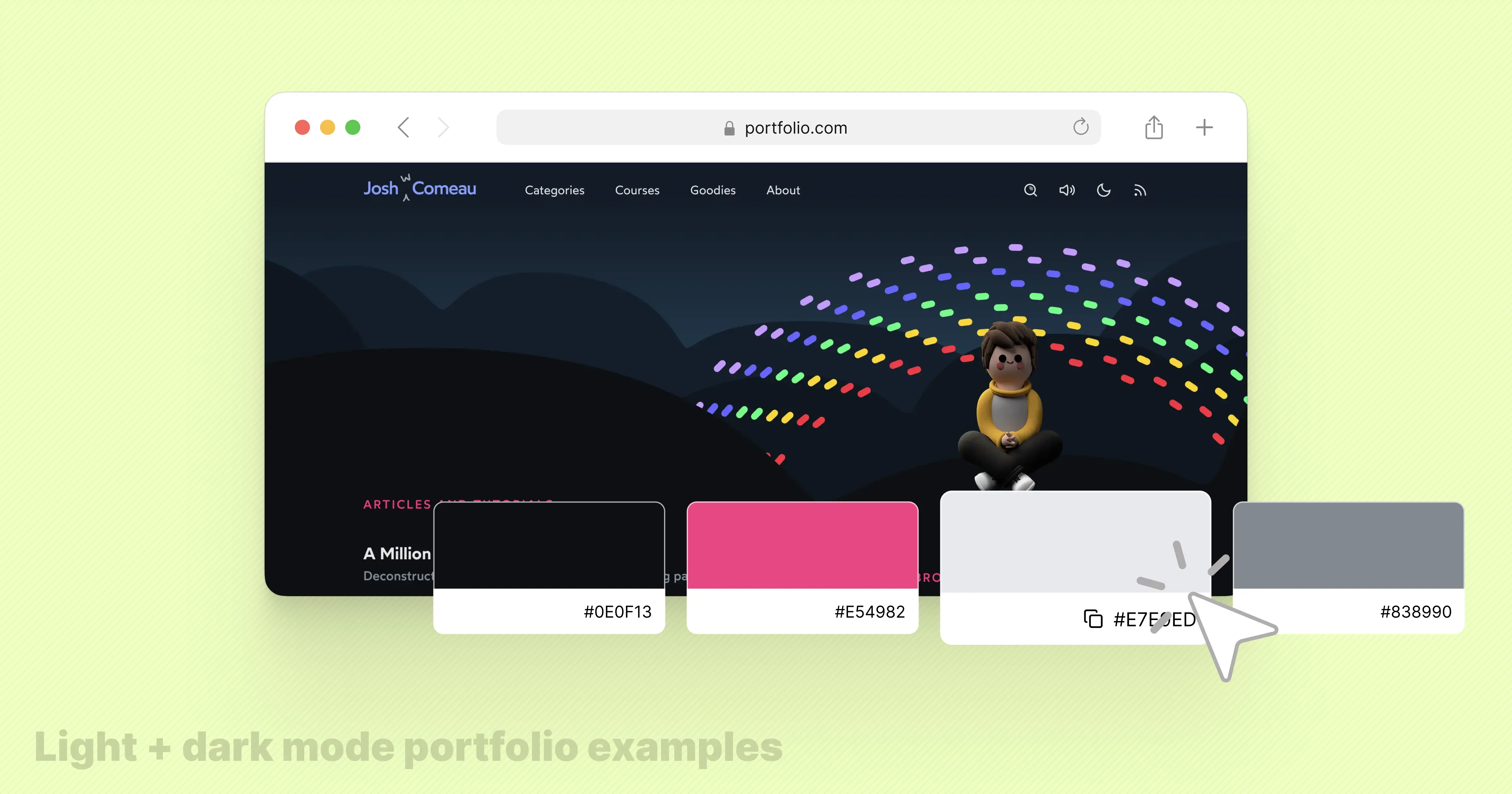
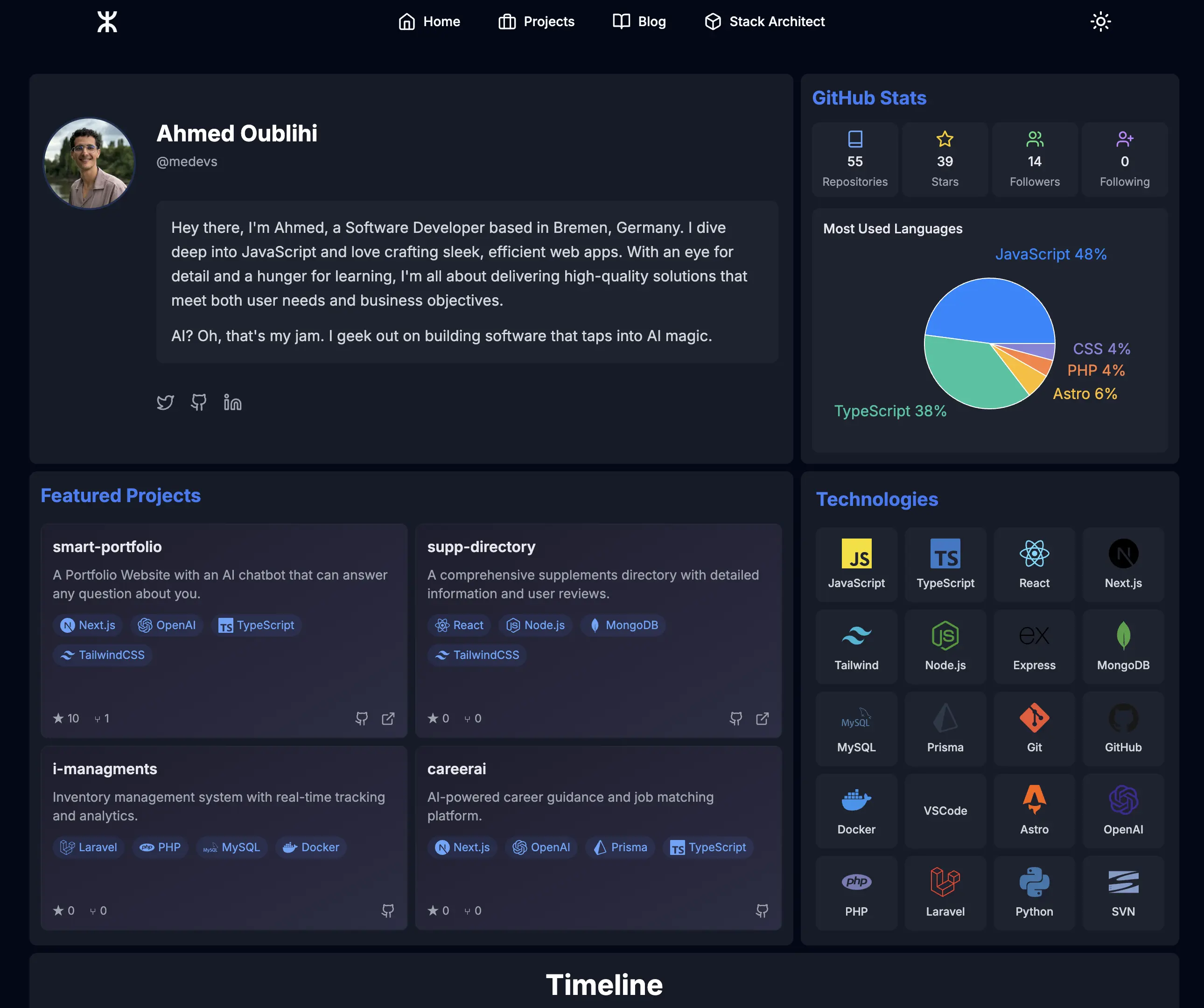
Ahmed Oublihi's portfolio is a great example, with colors thoughtfully adapted for both light and dark modes.
Drag the slider to watch the color palette transition between light and dark mode, showing how strategic color choices maintain readability and style.

By avoiding these mistakes, you’ll create a polished, accessible, and engaging portfolio that leaves a lasting impression.
Portfolio Color Palette Ideas for Developers
If you're unsure where to start, here are five carefully curated color palettes for developer portfolios, each designed to create a unique and impactful impression:
1. Minimalist & Modern
Perfect for frontend developers who want a sleek, professional look.
- Background: #F4F4F4 (Light Gray)
- Primary: #2E2E2E (Charcoal)
- Secondary: #FFFFFF (White)
- Accent: #4A90E2 (Muted Blue)
2. Bold & Creative
Ideal for designers and creative developers who want to showcase personality.
- Background: #1B1B1B (Deep Black)
- Primary: #F8B400 (Vibrant Yellow)
- Secondary: #E63946 (Rich Red)
- Accent: #FFFFFF (White)
3. Tech & Futuristic
Great for backend developers, AI engineers, or cybersecurity professionals.
- Background: #0F172A (Dark Navy)
- Primary: #22D3EE (Neon Cyan)
- Secondary: #64748B (Cool Gray)
- Accent: #F4F4F4 (Light Gray)
4. Earthy & Trustworthy
A natural, approachable palette for developers working in sustainability or ethical tech.
- Background: #E9C46A (Warm Gold)
- Primary: #264653 (Deep Teal)
- Secondary: #2A9D8F (Vibrant Green)
- Accent: #FFFFFF (White)
5. Elegant & High-End
Best for senior developers or consultants wanting a refined, luxury feel.
- Background: #1C1C1C (Soft Black)
- Primary: #BFA181 (Muted Gold)
- Secondary: #D4C5B0 (Warm Beige)
- Accent: #F4F4F4 (Light Gray)
Each of these palettes can be easily tested with dark mode variations and adjusted to fit your personal branding. Try experimenting with different backgrounds, buttons, and hover states to see how they work in real scenarios!
Interactive Portfolio Preview
Want to see how these color palettes feel in a real portfolio section? Try out the interactive portfolio preview below to experiment with background color, text color, and accent color in real time. This can help you understand how different combinations affect readability, hierarchy, and overall style.
Hi, my name is John Doe
I'm a frontend developer building beautiful and interactive web experiences.
Note: Use the controls to change background, text, and accent colors, along with heading and body fonts, to preview a mini portfolio hero section.
Tools to Help Create a Portfolio Color Palette
Choosing the perfect color scheme is easier with the right tools. Here are some excellent resources:
- 🎨 Coolors – Generate and explore trending color palettes.
- 🌈 Adobe Color – Experiment with different harmonies and export palettes.
- 📊 WebAIM Contrast Checker – Ensure text contrast meets accessibility standards.
- 👁 Colorblind Web Page Filter – Simulate color blindness for inclusivity testing.
- 🖌 Dribbble – Browse real-world designs for inspiration.
Real-World Developer Portfolio Examples for Color Inspiration
Here are some great developer portfolios that use effective color palettes:
1. Brittany Chiang – Dark, sleek, and modern with neon accent colors.
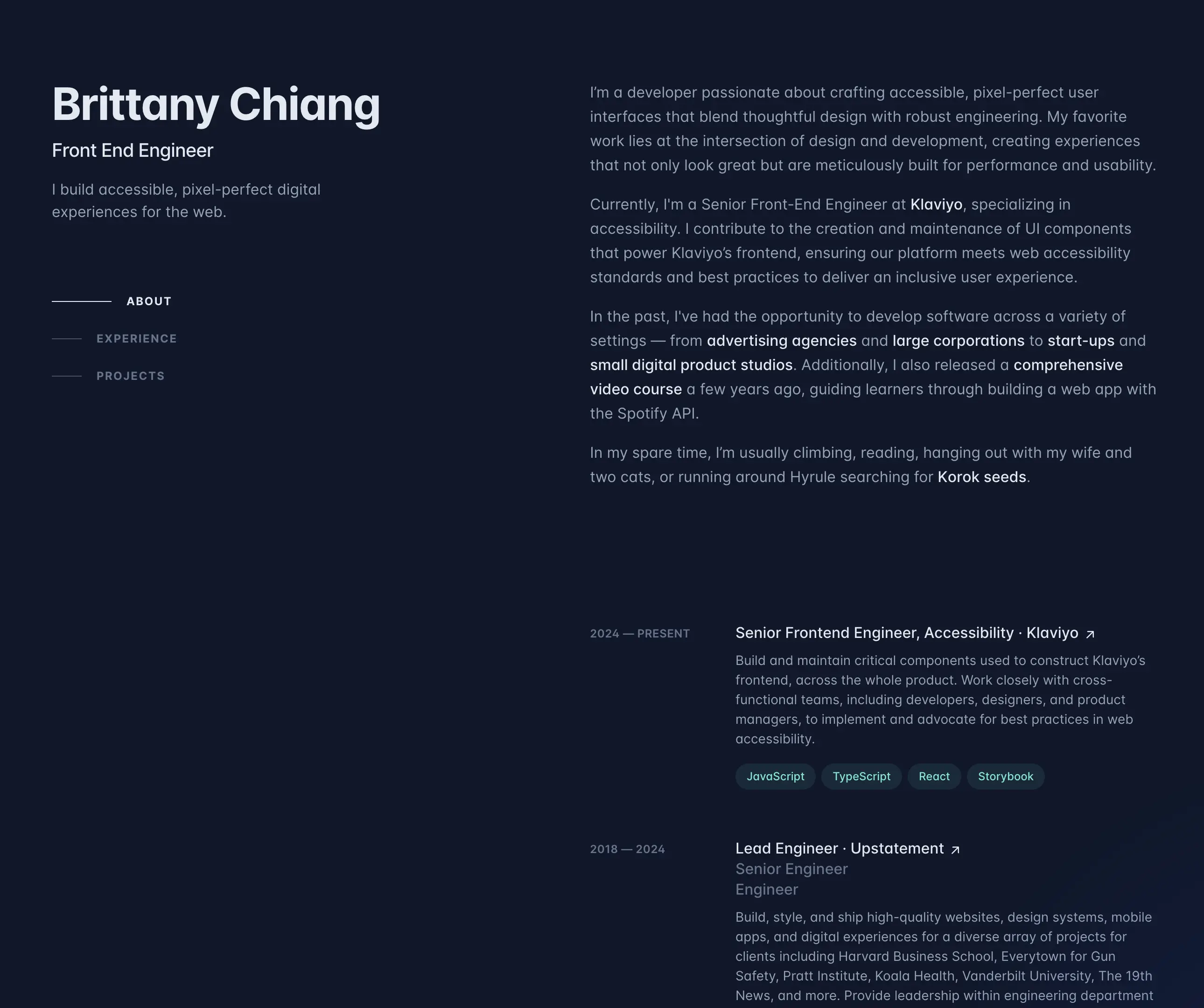
Brittany Chiang's Developer Portfolio Color Palette
- Background: #11172a (deep-dark blue)
- Text: #626c7d (medium gray)
- Accent: #599692 (pastel green)
- Highlighted Text: #dfe5ec (light gray)
2. Josh W Comeau – Friendly, warm tones with great contrast.
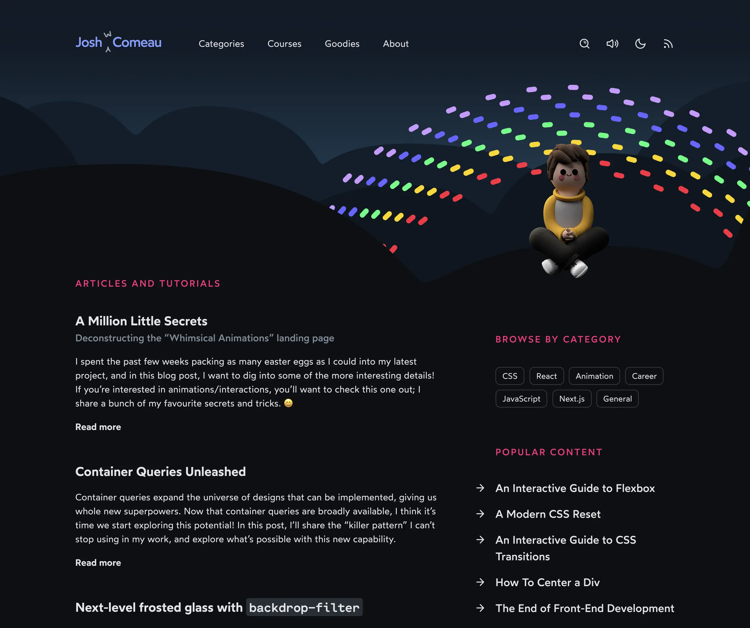
Josh W Comeau's Blog Oriented Developer Portfolio Color Palette
- Background: #0d0f12 (near black)
- Text: #c7cacc (medium gray)
- Accent: #c91b68 (neon red)
- Hover: #809fff (light pastel blue)
3. Ryan Jacobson – Dark and neon colors for clean aesthetic.
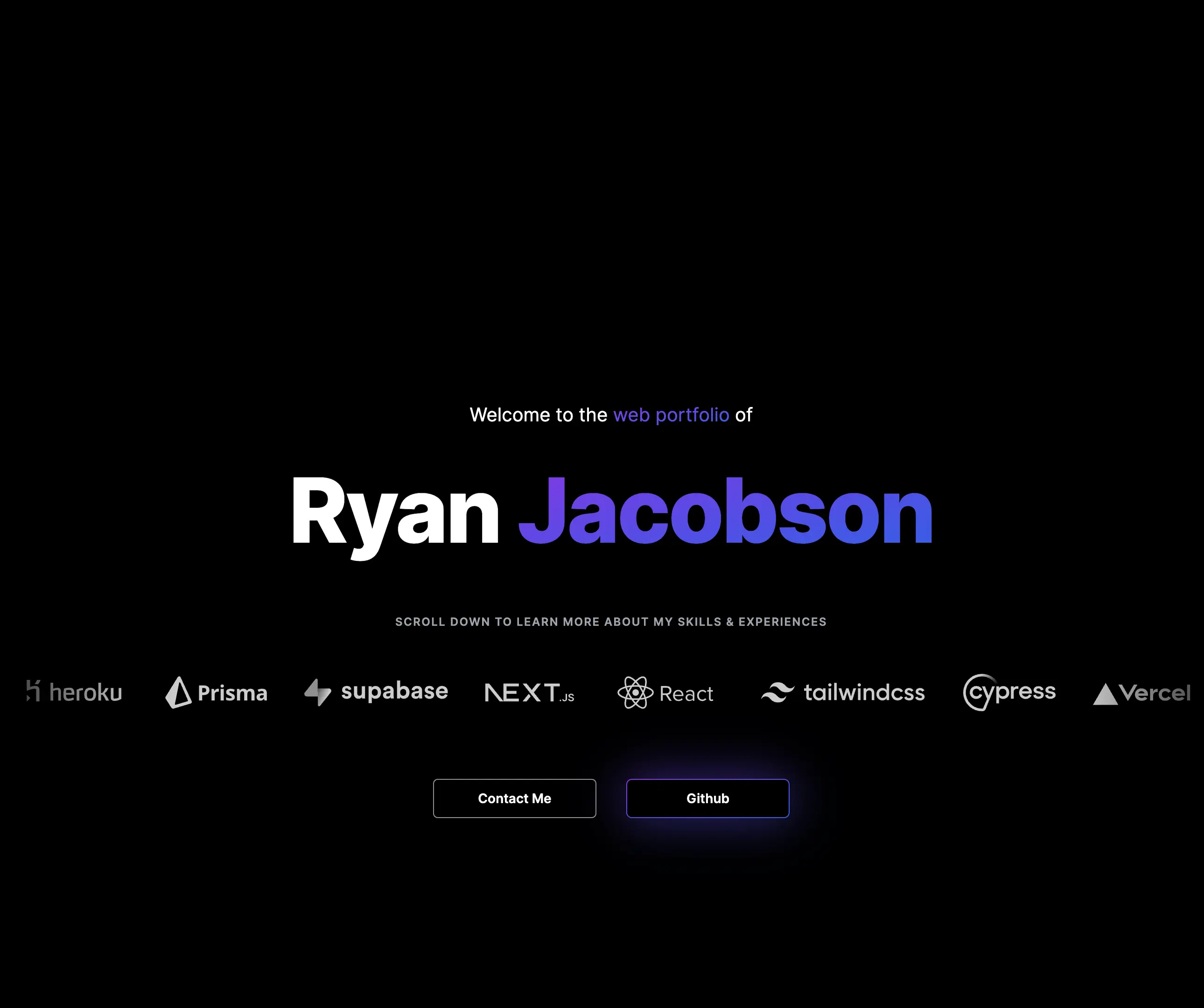
Ryan Jacobson's Full Stack Developer Portfolio Color Palette
- Background: #000000 (black)
- Text: #ffffff (white)
- Accent: #6049ea (pastel purple)
4. Jean de Dieu – Professional blue-dark mode colors.

Jean De Dieu's Full Stack Developer Portfolio Color Palette
- Background: #111827 (deep-dark blue)
- Text: #ffffff (white)
- Accent: #01c16a (bright pastel green)
5. Yagyaraj – Neutral colors with no accents for minimal style.
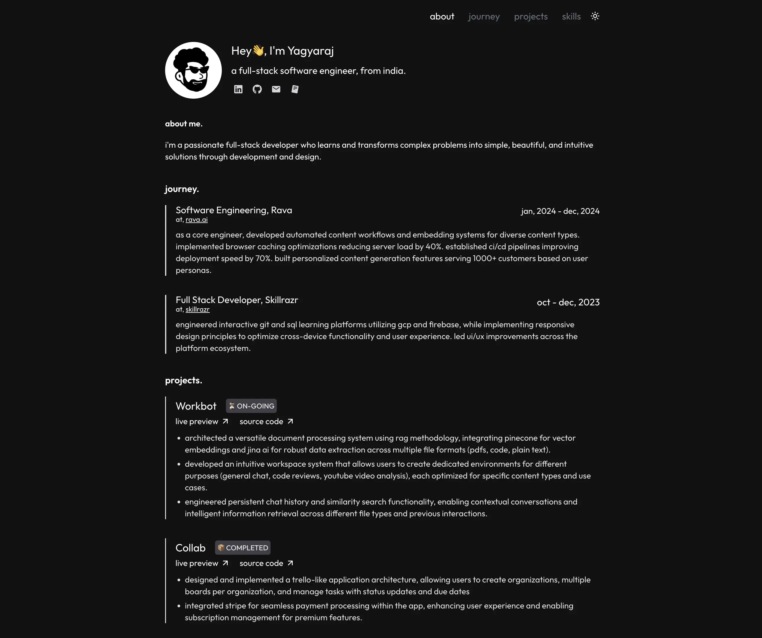
Yagyaraj's Full Stack Developer Portfolio Color Palette
- Background: #121212 (near black)
- Text: #ffffff (white)
Conclusion
Choosing the right color palette for your developer portfolio is a crucial step in showcasing your personal brand and professionalism. It’s not just about aesthetics—it’s about creating a memorable, user-friendly experience. Have you considered what your colors say about you?
Keep it simple with a few key colors that reflect your style and make your portfolio easy to navigate. Test your palette for accessibility and ensure it looks great in both light and dark mode. Tools like Coolors and Adobe Color can help you find the perfect combination.
Ultimately, your color choices should reinforce your skills and make a lasting impression.
For a deeper dive into building an interview-ready portfolio, check out our Complete Guide: Building a Junior Developer Portfolio That Gets Interviews (2025)[/blog/junior-developer-portfolio-guide-2025].